


Intro Video
Here is a short animation to show the features of the app.
*MUSIC: wWW.BENSOUND.cOM
Research
It's so common to see but so weird that many people don't listen to the podcast as often as they listen to music. I did some research to find out the problem of why podcasts cannot hook them.
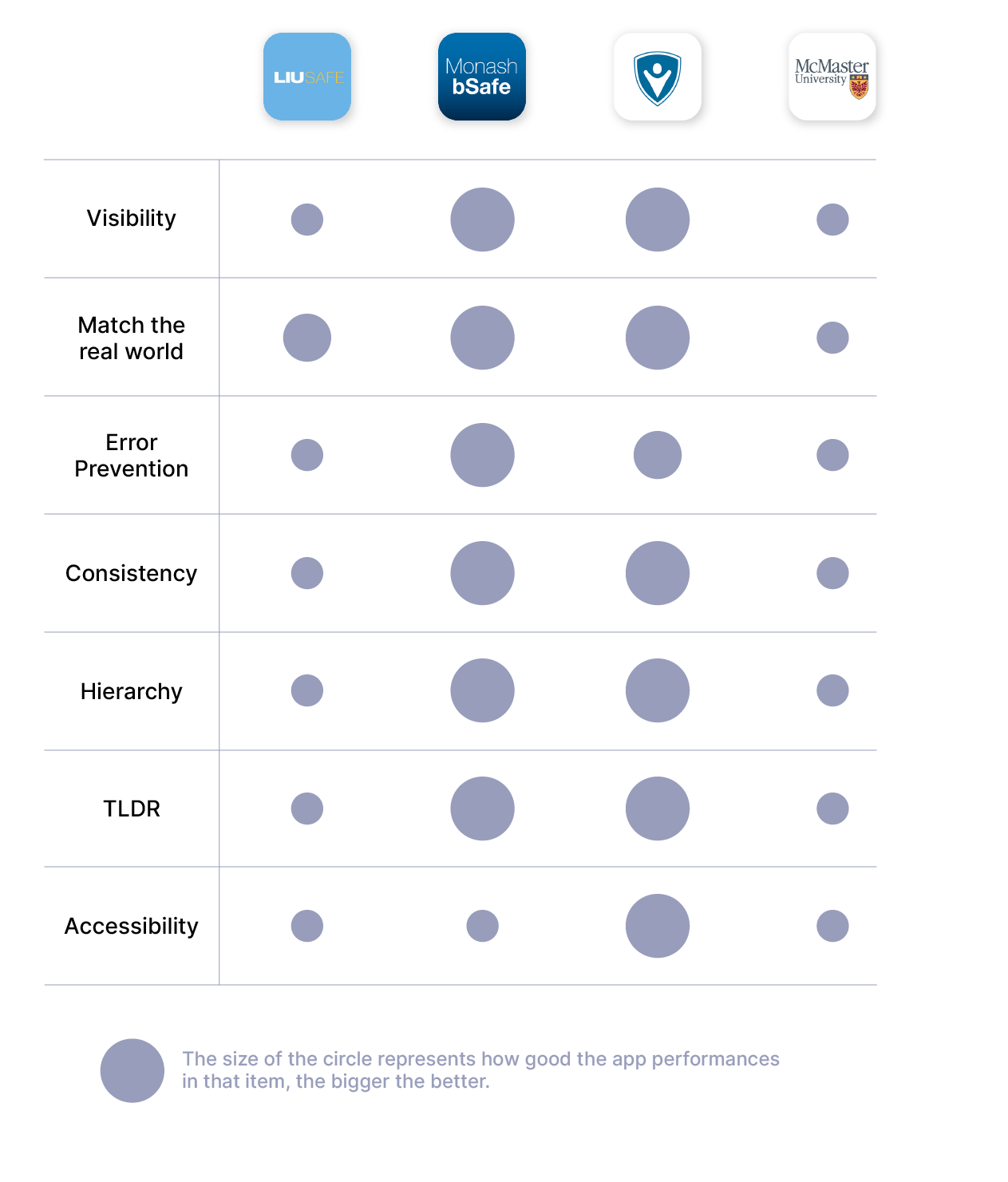
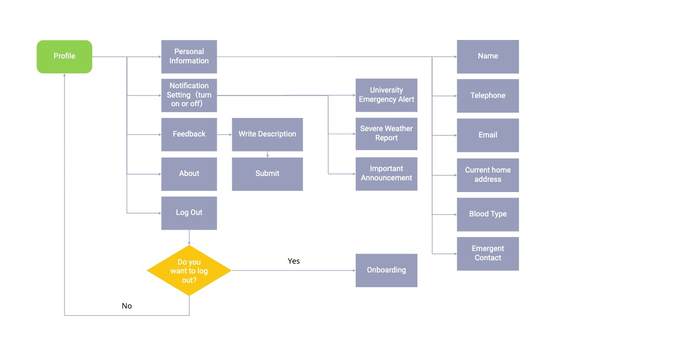
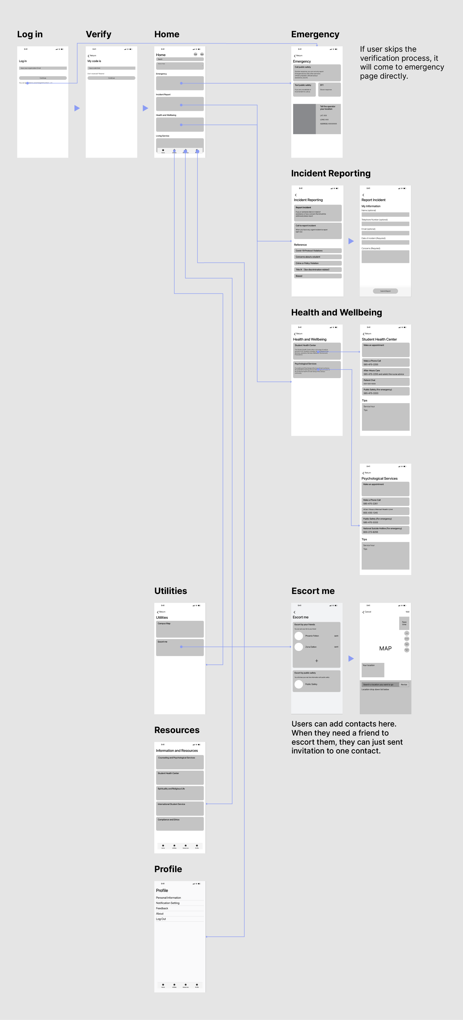
Cognitive Walkthrough

*Click the image to zoom in
Interview

Kyle
"I can't spend too much time listening to podcasts, especially for the long episodes, because I'm too busy. I think it will be helpful if some tools that can help me to utilize my fragmented time. And I feel that very few podcast app provides good communicate function. I usually have many thoughts and feels to share, but there is no space for me to post."

Wynn
“I like to listen to audiobooks. Usually, I get the recommendation of those books by checking comments and discussions from others. Thus, I don’t like the atmosphere that Spotify provides. I can’t interact with other users there.”

Ben
"I enjoy using podcasts to explore some English channels. Because English is not my primary language, sometimes, I feel it is hard for me to understand the episode's content, especially when the speech is too fast or the accent is unfamiliar. I wonder if there have some tools that can help me to understand that more clear. I think it would be helpful."
pain Points
According to the interview, I concluded 3 challenges that cause users do not listen to podcasts as often as they listen to music.
1. Language Barrier
Language is a barrier for users to explore foreign language channels.
2. Long Episode
It’s difficult for a busy user to complete a long time episode.
3. Lack of Interaction
Those users who are willing to share their thoughts and feels find no space for them to post.
How might We?
What if I could do to help users to overcome those pain points?
1. How might we help users to follow the content of podcasts way more easy?
Heavy accent or foreign language can make users hard to follow the podcast content, so what if I could make that easier for users to understand and digest?
2. How might we make long podcast enjoyable?
A long podcast could be an arduous task for users to listen to. Some users think it is too long to be enjoyable, and others think they do have not enough time to listen. Thus, what if I could transform a long podcast into a more cushy thing that can be enjoyable?
3. How might we allow users to communicate their thoughts?
Users want to share their thoughts and minds with others. They want to make friends with people who have interesting hobbies and ideas. Also, they want to get helpful information from others' thoughts. Therefore, what if I could create some features that allow them to communicate?
Solutions
At the very beginning, I assumed many ideas to answer “How might we help users to achieve their goals?” After brainstorming and discussing, I removed those ideas which would not work. Here are the solutions that can successfully help users overcome those challenges.
1. Speed Adjustment, Transcripts, Auto-Translation
Showing automatic transcripts and translation for users to check. Allowing users to adjust the spoken speed.
2. Split Episode
Allowing users to split a very long episode into several shorter pieces.
3. Review, Rate, Tag, Comment, Reply
Allowing users to rate, review and tag the podcast channels. They can also share their minds with others.
User Story

john
“As a curious and busy guy who likes to learn a foreign language and interact with others, I find it difficult to know if a podcast channel is good before I try by myself. Also, I cannot fully understand the content when I try to explore some foreign ones. I want some tools that can help me understand the meaning of foreign channels’ content to enjoy it well. Besides, I like to share my thoughts and experience with others. I hope there will have some places for me to do that.”
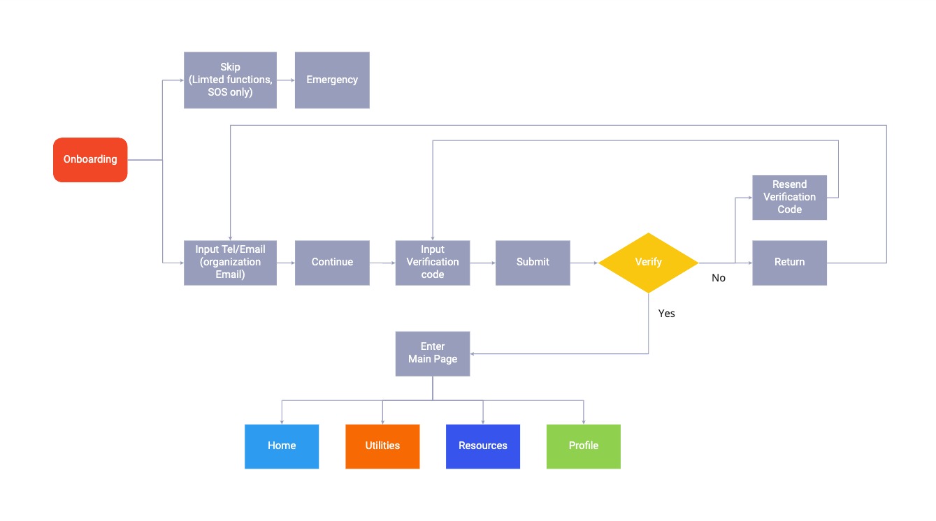
User Flow
For the Challenge 1: Transcripts, Speed Adjustment

*Click the image to zoom in
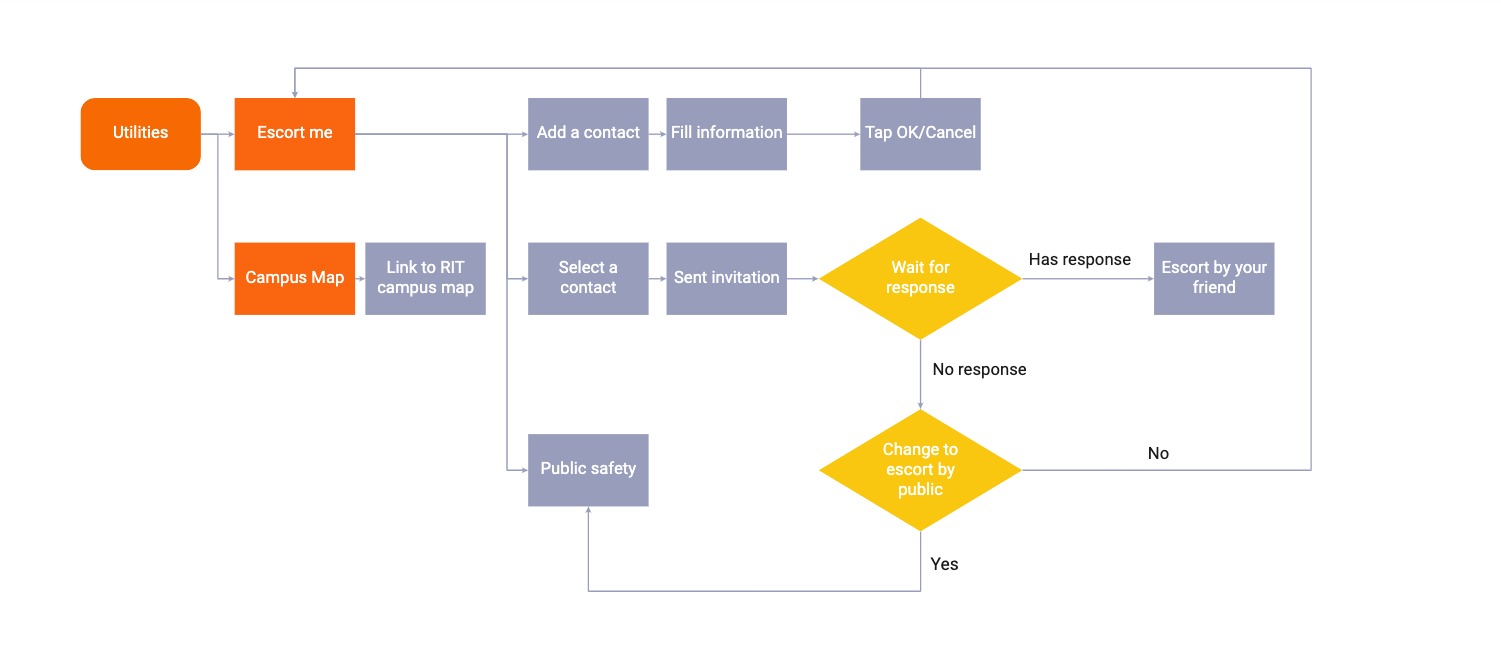
For The Challenge 2: Episode Split

*Click the image to zoom in
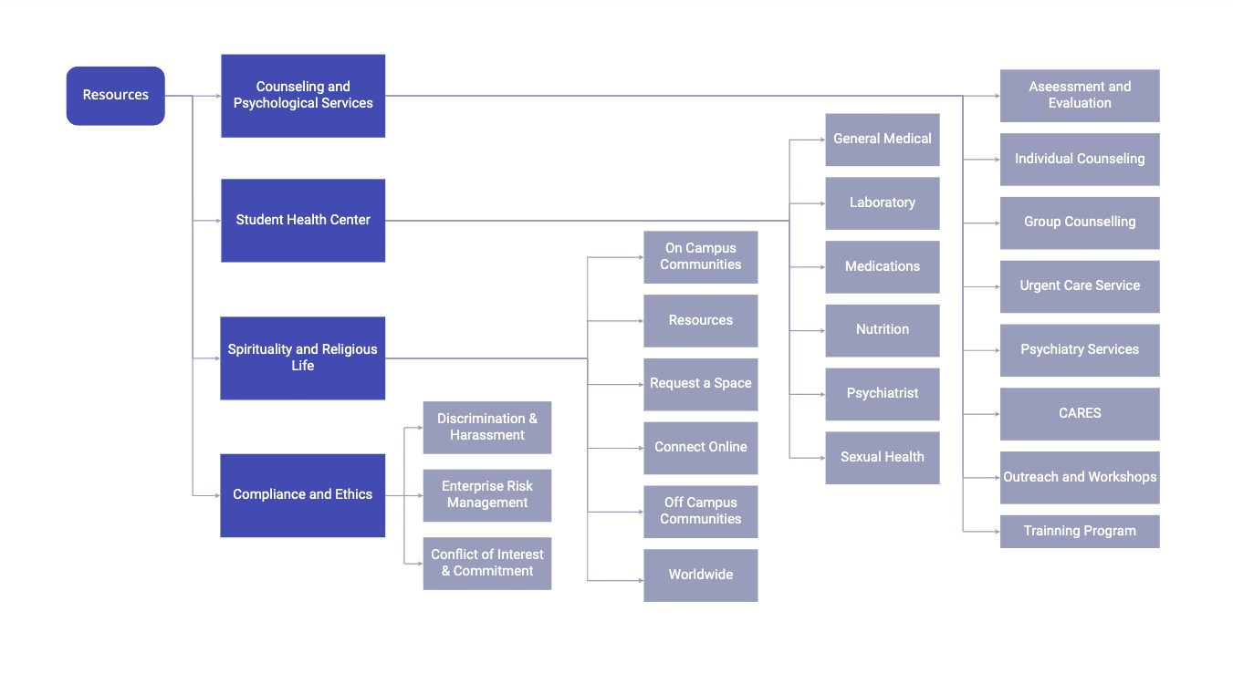
For The Challenge 3: Review, Rate, Tag, Comment, Reply

*Click the image to zoom in
wireframing
I wanted to know what the core of the app looks like before I onto the high fidelity wireframes and mockups. It gave me a good start to run this design.

Home

Channel Page

Leave Comments

Reviews

Split Episode

Split List

Transcripts
Back and forth
I made many iterations during the design process and got positive feedbacks.

showcase
Design for screens

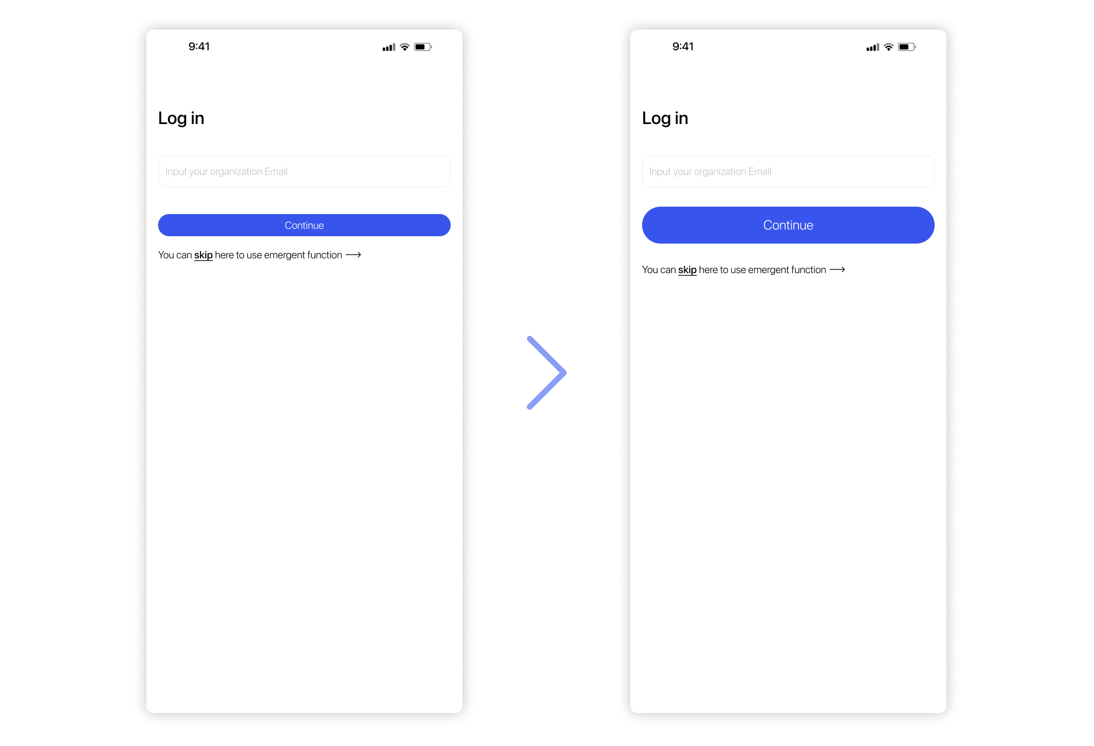
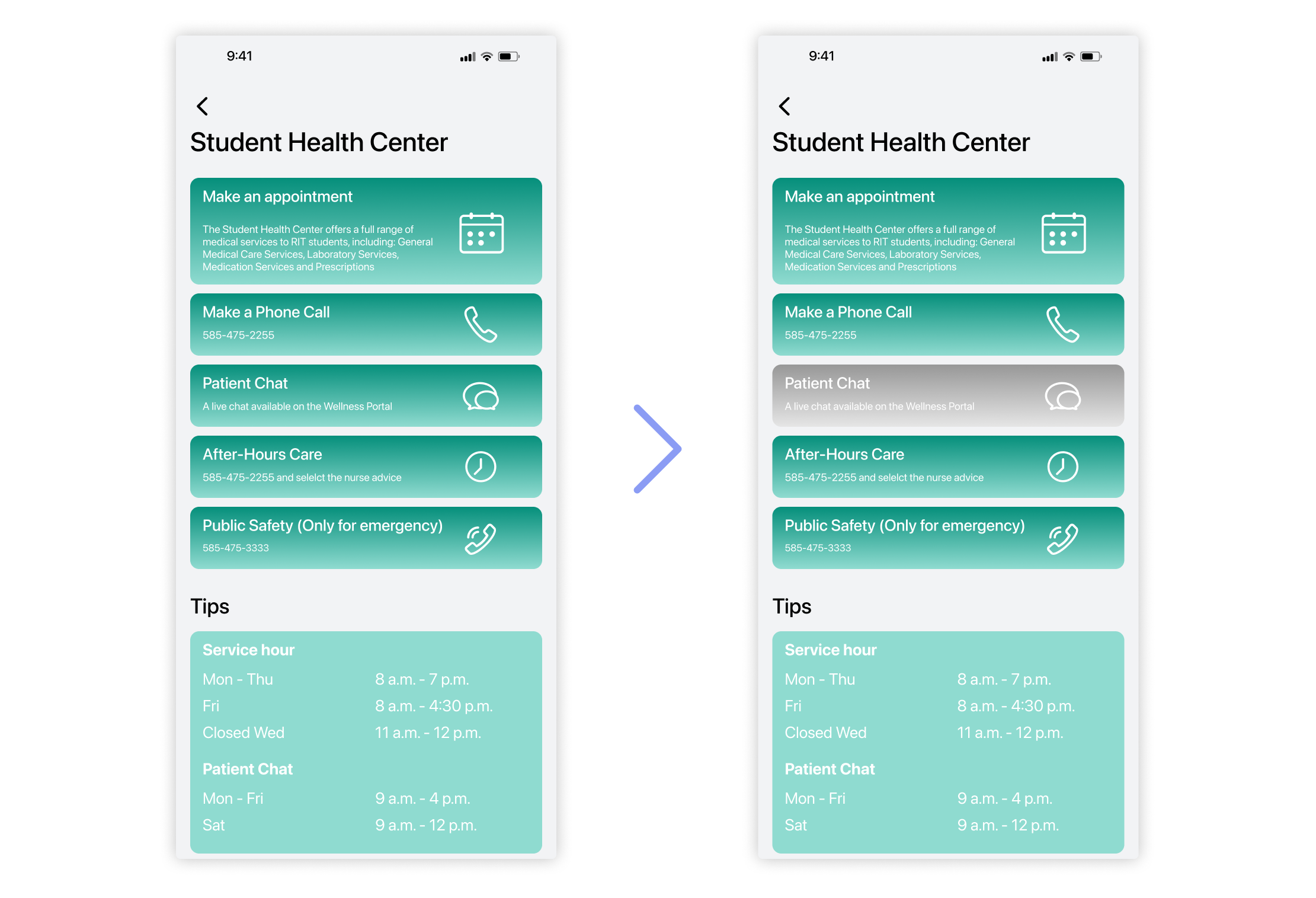
Prototyping For The Challenge 1:

Translations & Transcripts
Users can check the transcripts and translation on the playing page, and tap the certain paragraph to repeat it.

Speed Adjustment
Users can tap the speed adjust button to choose the speed they want to play episode.
Prototyping For The Challenge 2:

Split Episode
Users can split the episode into many parts by tapping the split button.
Prototyping For The Challenge 3:

Reviews & Rates & Tags
Users can rate the channel from 3 different aspects. They can also customize tags for the channel and write down their reviews.

Comments
You can write down your thoughts and feels about the episodes, or you can post your questions here, waiting for other users to reply you.

Reply
Users can check others' comments and make
Smartwatch pairing
Design screens For Smartwatch Pairing:

Now Playing
Open the app and tap the now playing button to check what is playing now.

Play An Episode
Check the playlists and enter into one of them. Users can tap the channel they want to enjoy, and select one of the episodes in it to play.

Split Episode
When users are in the playing page, tapping the icon on the bottom right corner of your screen. Users can choose how many parts they want it to be divided into. Then the button will automatically become a playlist. Users can choose which part they want to play.

Speed Adjustment
Users can tap the bottom left corner button to adjust speech speed when they are in the playing page.
progress Adjustment
Users can check the translations and transcripts here to see what's going on for the podcast.
Design brief
I want my users to more focus on what the app is delivering, so I choose a relatively dark color scheme for my UI Design. Also, I pick a highly contrast color scheme to highlight the important information. Besides, purple is a kind of mysterious color, which means that the app is waiting for the users to discover infinite channels.


.svg)


